7.4 - Plotting Graphs & Bar Charts
What a graph question looks like
You're given a set of results in a table and asked to plot them on square-ruled paper.
What you're marked on
- Label both axes with the quantity and its unit, written as "quantity / unit".
- Choose a linear scale so the points fill a good part of the grid in both directions.
- Plot every point accurately as a small cross.
- Draw a line of best fit through the points.
If there are two sets of results on the same grid, add a key showing which line is which.
A typical question
A student measured the current through a resistor at six different potential differences. The results are shown in the table. Using the square-ruled paper, draw a graph of the student's results.
Setting up a graph
Line graph or bar chart?
- Line graph - Draw one when the variable you changed is a continuous number, such as potential difference, length, time, or temperature.
- Bar chart - Draw one when the variable you changed is discrete or categoric (e.g. different materials or components).
Labelling the axes
- The variable you change goes along the bottom, on the x-axis.
- The variable you measure goes up the side, on the y-axis.
- Label each axis with the quantity and its unit as "quantity / unit" (e.g. Potential difference / V).
Choosing the scale and plotting the points
A linear scale that fills the grid
- Find the biggest value you need to fit on each axis.
- Pick an interval that reaches near the top of the grid and goes up in 1s, 2s, or 5s per square.
- Linear means equal steps for equal squares, all the way along. A scale running 0, 10, 20, 50, 100 is not linear.
Plotting the points as crosses
Plot each reading as a small, sharp cross, not a dot.
Worked example - Graph of current against p.d.
A student measured the current through a resistor at six potential differences.
| Potential difference / V | Current / A |
|---|---|
| 0 | 0 |
| 1.0 | 0.08 |
| 2.0 | 0.17 |
| 3.0 | 0.24 |
| 4.0 | 0.33 |
| 5.0 | 0.41 |
Step 1 - Choose the graph type and axes
Potential difference is continuous, so it's a line graph. It was the variable changed, so it goes on the x-axis; current goes on the y-axis.
Step 2 - Choose the scale
The x-axis needs to reach 5.0 V, so one large square is worth 1.0 V. The y-axis needs to reach 0.41 A, so one large square is worth 0.05 A.
Step 3 - Plot each reading as a cross
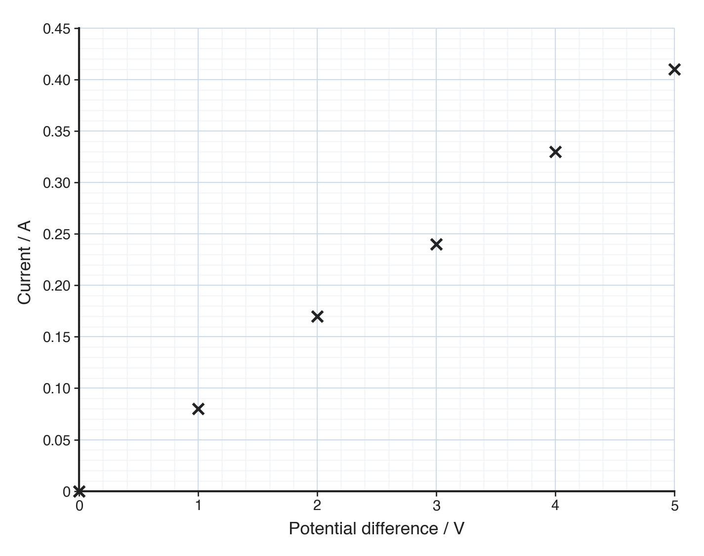
The points are plotted alone; the line of best fit comes next.
Drawing the line of best fit
- A line of best fit is a single line drawn through the middle of your points - not a series of short lines joining one point to the next.
- Draw it with a ruler if the points fall in a straight line, or as one smooth curve if they clearly bend.
- Aim for roughly as many points above the line as below it, and let it pass close to the points rather than through every one.
When the line goes through the origin
- A straight line heading for (0, 0) should be drawn through the origin.
- A straight line through the origin tells you the two quantities are directly proportional.
- If the line is straight but cuts the y-axis above zero, the two quantities are not proportional.
Check your graph with SPLAT
- Scale - Linear, and the points fill a good part of the grid in both directions.
- Plot - Every point is a sharp cross in the correct position.
- Line - A single line of best fit drawn with a ruler (or as a smooth curve).
- Axes - Variable changed on the x-axis, variable measured on the y-axis.
- Titles - Both axes labelled with "quantity / unit", and a key if more than one set is plotted.
Common exam questions
Question 1
A table gives the current through a resistor at five potential differences and asks you to draw a graph. Should it be a line graph or a bar chart?
A line graph, because potential difference is a continuous variable. Label both axes with quantity and unit, choose a linear scale that fills the grid, plot each point as a cross, and draw a line of best fit through them.
Question 2
A student compares the resistance of five different metal wires of the same size. Should the results be shown as a line graph or a bar chart?
A bar chart, because the variable changed (the type of metal) is discrete rather than a continuous number.
Question 3
A student plotted every point accurately and then joined them with short ruled lines from one point to the next. What is wrong with this?
It is a dot-to-dot rather than a line of best fit. National 5 Physics wants one line drawn through the middle of all the points, straight or smoothly curved, not a zigzag joining them.
Question 4
A student's line of best fit is straight and passes through the origin. What does this tell you about the two quantities?
That they are directly proportional: doubling the potential difference doubles the current.
Question 5
A student uses a scale that runs 0, 10, 20, 50, 100 up the y-axis. Why is this a problem?
It is not linear, because equal squares do not represent equal steps. It also makes anything read off the graph afterwards unreliable.
Question 6
A student's plotted points fill only about a third of the grid. What should have been done differently?
A scale should have been chosen from the largest values in the data, so the points spread across a good part of the grid in both directions.
Question 7
When does a graph need a key?
When you plot more than one set of data on the same grid, so the key can say which line is which.